A guest pulls up to your hotel. They haven’t spoken to anyone yet, haven’t tasted the breakfast. They haven’t touched the mattress.
But they’ve already formed an opinion.
It happened in the first 7 seconds — from the moment they spotted your facade, read your entrance sign, and walked through your lobby. Your signage did the talking. The question is: what did it say?
Most hotels invest heavily in interior design, staff training, and digital marketing — and then cut corners on signage. The result is a brand that looks great on Instagram but feels disconnected and generic in real life.
This guide covers what a complete hotel signage system actually looks like, what mistakes cost you guests, and how to build a visual identity that works from the parking lot to the penthouse.
Why Hotel Signage Is a Brand Asset, Not a Line Item
Let’s be direct: signage is not decoration. It is the physical expression of your brand identity at every touchpoint a guest interacts with.
In the hospitality industry, trust is currency. And trust is built before any human interaction takes place. Research consistently shows that physical environments — including signage, lighting, and spatial design — account for a significant portion of a guest’s first impression and satisfaction score.
Bad signage doesn’t just look unprofessional. It creates friction, confuses guests. It signals that details don’t matter to you — which is exactly the opposite of what hospitality is supposed to communicate.
Premium hotels understand this. That’s why their signage systems are not an afterthought — they’re engineered as part of the brand architecture from day one.
The 4 Signage Zones Every Hotel Must Control
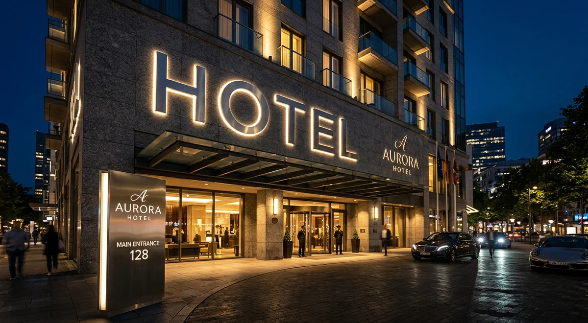
1. Exterior Signage — The First Contact
Your exterior sign is working 24 hours a day. Even when your staff isn’t. Even when your website is loading slowly. It is the most persistent brand touchpoint you have.
For hotels, outdoor signage must solve three problems simultaneously: visibility from a distance, brand precision up close, and durability across seasons.
What works:
- Illuminated 3D letters mounted on the facade — high-impact, night-visible, architecturally integrated
- Steel totems at the property entrance — essential for hotels set back from the street or with large parking areas
- Backlit channel letters — clean, professional, legible from 50+ meters at night
What doesn’t work:
- Flat vinyl lettering on glass — it degrades quickly and reads as budget
- Generic pylon signs with interchangeable panels — they communicate “chain” not “character”
- Under-lit or unlit facades — invisible at night means invisible to a major portion of your audience
If your hotel has an entrance gate, a parking area, or sits on a road with moving traffic, a totem sign is not optional. It is functional architecture.
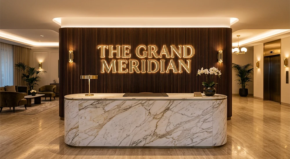
2. Lobby and Reception Signage — The First Interior Impression
The lobby is where first impressions are confirmed or contradicted. If your exterior promises luxury and your lobby delivers generic foam-board letters — you’ve lost the guest before they’ve checked in.
Indoor signage in hotel lobbies must align precisely with the overall interior design concept. This is not the place for compromise materials.
High-performing lobby sign formats:
- Backlit 3D logo letters behind reception — dimensional, premium, brand-consistent
- Brass or stainless steel cut letters — ideal for classic, heritage, or boutique hotel positioning
- LED neon flex elements — works for lifestyle hotels and urban boutique properties targeting younger demographics
- Dimensional wall-mounted brand panels — combine brand storytelling with architectural presence
The reception wall is the most photographed surface in any hotel lobby. Every guest who checks in looks at it. Many photograph it. It appears in every review photo, every influencer story, every Google listing image. What is yours communicating right now?
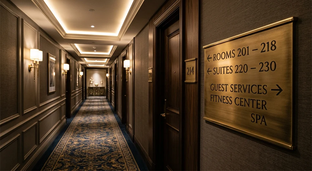
3. Wayfinding Signage — The Guest Experience System
Wayfinding is where most hotels fail completely.
The logic is simple: if a guest can’t find their room, the spa, the restaurant, or the emergency exit without asking someone — your wayfinding system has failed. And a failed wayfinding system creates frustrated guests, overwhelmed staff, and a property that feels poorly managed.
Good wayfinding signage is invisible when it works — guests navigate intuitively. It becomes very visible when it fails.
A functional hotel wayfinding system includes:
- Floor directory signs — at each elevator landing, clearly indicating room number ranges and amenities
- Corridor directional signs — suspended or wall-mounted, consistent in height and typography
- Room number plates — matching the brand language, durable, ADA-compliant where required
- Amenity identification signs — restaurant, gym, pool, spa, conference rooms
- Emergency and safety signs — fire exits, evacuation routes — these must be visible, always
The non-negotiable rules of hotel wayfinding:
- Consistency — every sign in the system must share the same typeface, material, and mounting logic
- Hierarchy — primary directional information must be instantly distinguishable from secondary
- Lighting — signs in dim corridors must be legible without guests straining to read them
- Brand coherence — the wayfinding system is part of the brand, not a separate functional layer
A wayfinding system designed to match your interior architecture and brand identity is also a marketing asset. It appears in every room tour, every travel blogger’s photos, every review.
4. Service Area and Amenity Signage
Conference rooms, spas, restaurants, fitness centers, rooftop bars — these spaces have their own identity within your hotel brand. Their signage must balance the parent brand consistency with the unique character of each space.
This is often where hotels apply the least creative effort. Generic acrylic plates that could belong to any office building. Foam-mounted numbers. Printed paper holders.
For a hotel positioning itself in the 4-star or 5-star category, these details destroy the premium perception built everywhere else.
What premium service area signage looks like:
- Custom-engraved metal or acrylic plates for room identification
- Illuminated amenity markers (pool, spa, bar) that work as destination cues
- Digital display integration for conference room booking — combining functional information with a modern brand experience (see LED display solutions)
Case Study: The Marmorosch Hotel, Bucharest
The Marmorosch is one of Bucharest’s most historically significant properties — a 5-star hotel built inside a 19th-century bank building, operated under the Autograph Collection by Marriott.
When a space carries that kind of architectural heritage, the signage cannot be generic. It must honor the existing visual language while communicating a contemporary luxury standard.
VIZAL produced the outdoor signage and premium brass wayfinding system for The Marmorosch. Every element — material choice, letter forms, mounting method, finish — was engineered to integrate with the building’s historic aesthetic while meeting modern visibility and durability standards.
The result is a signage system that guests notice not because it screams for attention, but because it belongs — completely and precisely — to the space it inhabits.
This is what premium hotel signage looks like in practice: invisible effort, visible quality.
The 5 Most Common Hotel Signage Mistakes
1. Mismatched materials across zones A luxury brass lobby sign undermined by plastic corridor plates. The inconsistency signals a lack of brand discipline.
2. Typography that doesn’t match the brand Generic sans-serif fonts on hotels with strong typographic brand identities. Typography is part of the brand — the signage system must use it correctly.
3. Undersized exterior signs A sign that looks appropriately scaled in the design file often disappears against the facade in real life. Scale for the viewing distance, not for the layout.
4. No illumination plan Exterior signs that work beautifully by day become invisible at night. In hospitality, night traffic is significant. Illumination is not optional.
5. Treating wayfinding as a budget category Wayfinding signs are used by 100% of your guests, every stay. Lobby art is admired once. Prioritize accordingly.
How to Plan Your Hotel Signage System
The most effective hotel signage projects start with a system brief, not individual sign orders. Here’s the framework:
1 — Brand audit What typography, colors, materials, and finishes define your hotel’s visual identity? Every signage element must align with these parameters.
2 — Zone mapping List every location where a guest needs information, identification, or direction. This becomes your signage inventory.
3 — Material and format specification For each zone, define: the appropriate material, mounting method, illumination requirement, and size range.
4 — Prototyping and approval For high-visibility elements (lobby, facade, entrance), request physical prototypes or precise 3D renders before committing to production.
5 — Installation coordination Signage installation in operational hotels must be coordinated around guest flow. A reliable signage manufacturer manages this — not just the production.
The Investment Framing
Hotels spend substantial budgets on photography, OTA advertising, and digital presence. These generate impressions. Signage generates experience.
A guest can close a browser tab. They cannot unsee a poorly designed lobby sign. They cannot un-experience a wayfinding system that sent them to the wrong floor twice.
The return on a well-executed hotel signage system is not measured in clicks. It’s measured in review scores, return visits, and the kind of word-of-mouth that no advertising budget can replicate.
Work with VIZAL on Your Hotel Signage
VIZAL has delivered custom signage systems for hotels and hospitality brands across Romania and Europe — from boutique properties to internationally branded luxury hotels.
We handle the complete process: consultation, design alignment, production, and installation.
Request a quote for your hotel signage project →
Explore our hospitality portfolio →